Reunion Gala
Logo design, event branding, brand identity, print design, web design
Each year, Hope House Colorado hosts a gala fundraiser event somewhere in the Denver-metro area. Each Gala has its own logo and branding that directs how the overall event’s tone and visual aesthetic will be used. In 2022, I was asked to create a logo and brand identity for the theme of “Reunion” while maintaining the organization’s overall brand and color scheme.

Inspiration
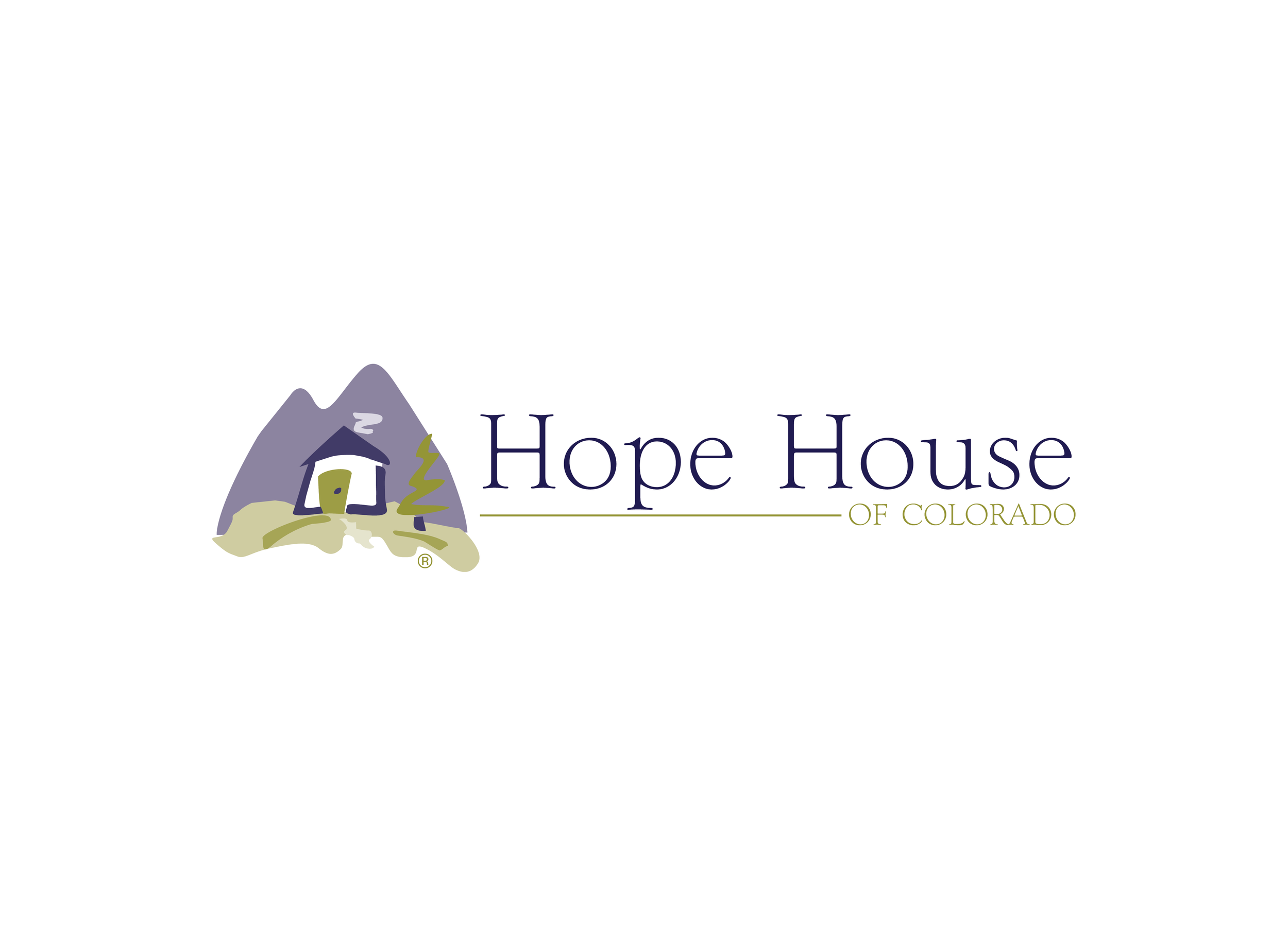
The organization wanted to celebrate it’s 20th annual gala in some way that paid homage to it’s early days. I saw the old Hope House logo (pictured left) and really liked the house illustration, so I asked if I could incorporate it into the gala logo, both for aesthetic and as a way to connect the gala branding to it’s earlier Hope House roots.
First Pass
I returned to the next gala meeting with four logos, two that incorporated the old house icon and two that relied on the high school aspect of the word “reunion”. The consensus was that the house icon worked well and helped create an aesthetic, but the high school, letterman-jacket style wordmark was cleaner and easier to read.
We eventually landed on a logo that incorporated aspects from all of the logos: the house icon from the organization’s previous logo, the letterman-style wordmark, and the highlighting of the 20th annual gala itself.
Design Motifs
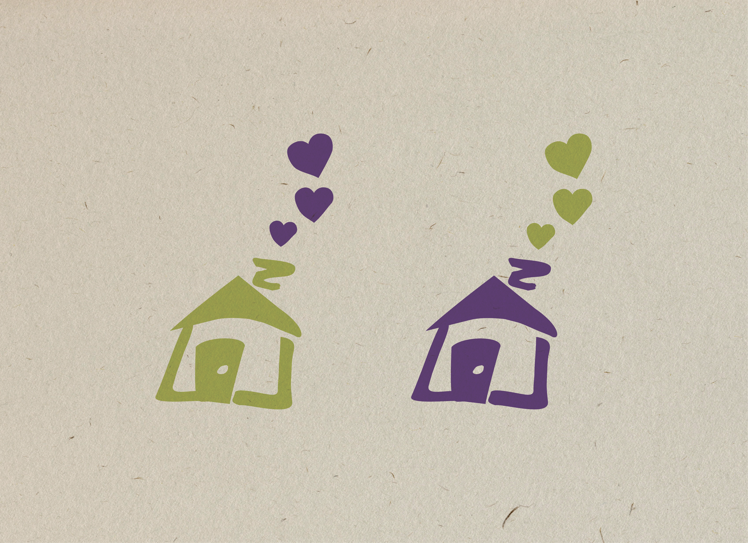
While planning out the gala video shoot (which you can view here), the organization and I spent a lot of time looking through old scrapbooks of polaroids. I liked the idea of tying in the the scrapbook aesthetic to the gala itself because it calls to mind the idea of reuniting. The picture on the left includes the design motifs and icons that we used for the rest of the event’s branding: the house icon, the “hand-drawn” hearts, and the scrapbooking paper background.